Clinical Worklist Dashboard – Streamlining Physician Workflow
Redesigned a complex clinical worklist dashboard used by physicians to manage daily patient reports, dictation, and transcription workflows. Improved usability, reduced task completion times, and laid the foundation for future ADA-compliant updates.
- Project Type Healthcare UX, Dashboard Design, Workflow Design, Accessibility (Pre-WCAG 2.1), Legacy Systems Redesign
- My Role UX Designer (Dashboard Design, Workflow Optimization, Accessibility Improvements)
- Tools Used Adobe Photoshop, Adobe Illustrator, Balsamiq, Axure RP
- Duration Mar 2015 – Aug 2016
- Company This project is protected by NDA.
Confidentiality Note:
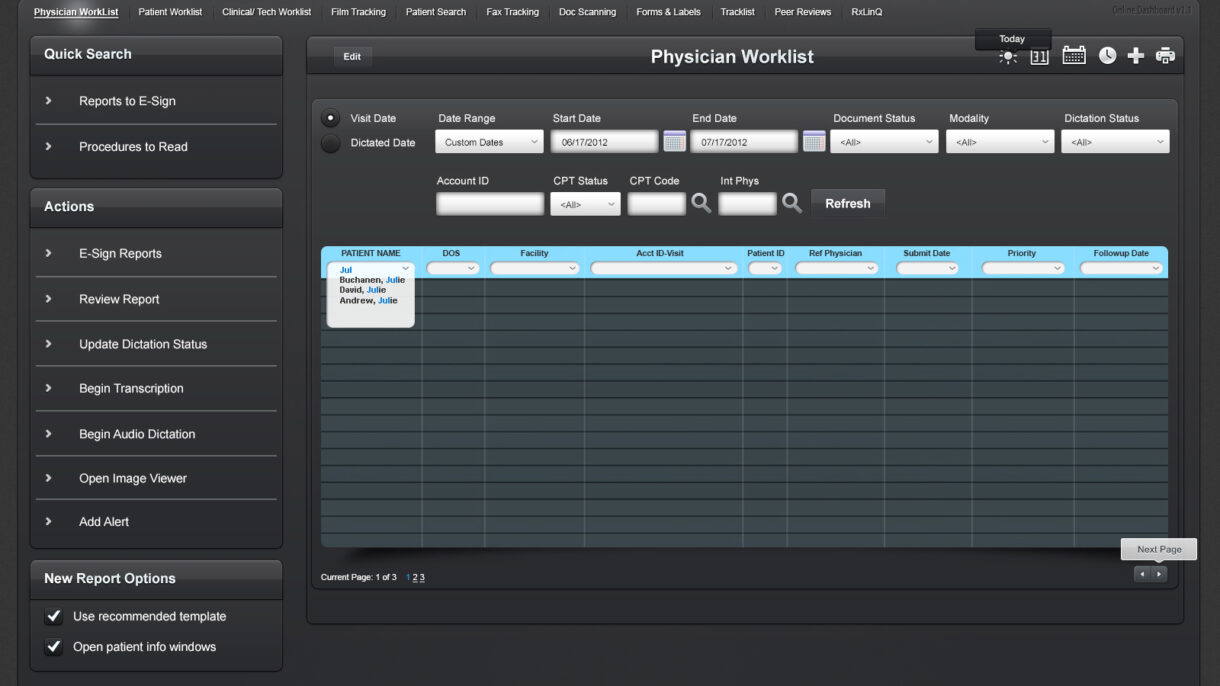
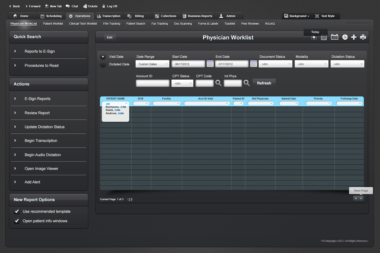
This project is protected by an NDA. Specific client and company details have been omitted. The attached screenshot showcases a general overview of the interface I designed, with all identifying information removed.
This dashboard was a critical tool in a healthcare platform that enabled physicians to track, review, and manage patient reports across multiple workflows—ranging from transcription to electronic signing.
The legacy system was heavily used but visually dense, difficult to navigate, and lacked modern usability and accessibility standards. I led the redesign initiative to modernize the interface, improve efficiency, and align it with evolving UX principles for medical applications.
The Challenge
✘ Outdated and text-heavy interface overwhelming users.
✘ Difficult-to-locate tasks within complex workflow hierarchies.
✘ Limited accessibility for users with visual and cognitive impairments.
✘ No component consistency or design patterns in place.
The Goal
✔ Improve usability and reduce cognitive overload for physicians.
✔ Simplify search, sorting, and report management workflows.
✔ Design for better screen-reader readability and ADA compliance.
✔ Deliver a flexible, scalable component structure for future updates.
My UX Process & Approach
Discovery & Research
- Conducted user interviews with medical staff to map pain points in report processing.
- Analyzed real usage patterns and prioritized high-frequency tasks.
- Audited the existing interface for visual hierarchy, interaction clarity, and accessibility.
Wireframing & Prototyping
- Used Balsamiq and Axure RP to wireframe early versions of the dashboard.
- Introduced tabbed navigation, action panels, and dynamic data sorting/filtering.
- Mapped out focus states and screen reader labels in early mockups.
UI Design & Accessibility Improvements
- Created clean UI layouts in Adobe Photoshop and Illustrator based on medical-grade visual principles.
- Improved color contrast, type size, and interactive affordances.
- Designed tooltip patterns and tab flow for easier keyboard navigation.
Collaboration & Testing
- Worked closely with developers and QA to ensure fidelity of interaction patterns.
- Gathered iterative feedback from physicians and transcriptionists.
- Partnered with compliance advisors to prepare groundwork for full ADA accessibility rollout.
Final Outcome & Impact
✔ Reduced time to locate and act on patient records by ~35%.
✔ Increased accuracy of dictation status tracking across roles.
✔ Created a modular component library for future interface updates.
✔ Improved accessibility compliance scores on internal audits.

A glimpse into the redesigned Physician Worklist interface, showcasing task filters, quick actions, and structured data views. Sensitive data and branding have been removed to comply with NDA requirements.
Key Takeaways & Learnings
✔ Complex healthcare dashboards demand clear hierarchies and action prioritization.
✔ Early accessibility planning saves rework and supports wider user inclusivity.
✔ Designing for medical environments requires balancing speed, accuracy, and cognitive ease.