Comprehensive Digital Healthcare Platform
Through a wide variety of mobile applications, we’ve developed a unique visual system and strategy that can be applied across the spectrum of available applications.
Through a wide variety of mobile applications, we’ve developed a unique visual system and strategy that can be applied across the spectrum of available applications.
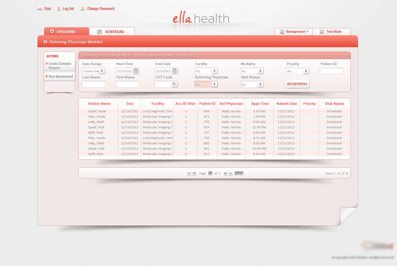
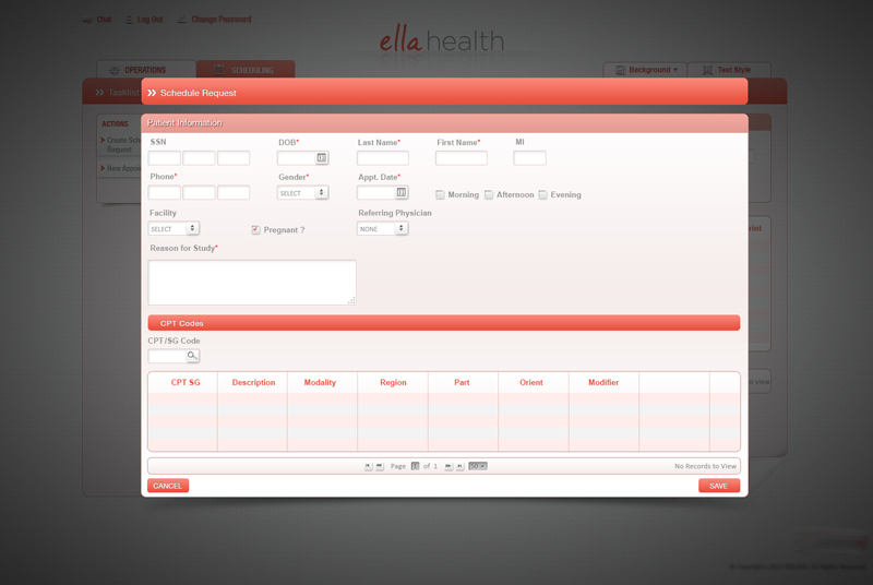
Ella Health is a comprehensive digital healthcare platform designed to help patients schedule appointments, consult doctors online, and access medical records. My role involved leading UX research, defining user flows, designing wireframes, and developing the final UI.
✘ Complex Navigation – Patients struggled to schedule appointments easily.
✘ Lack of Personalization – The platform didn’t adapt to user preferences or history.
✘ Poor Accessibility & Mobile Experience – The design was not responsive and had low contrast, making it hard for elderly users.
✔ Simplify appointment booking with an intuitive, user-friendly experience.
✔ Create a patient-centric, personalized experience based on user needs.
✔ Ensure accessibility & mobile-friendliness to support all user demographics.
✔ User Interviews: Conducted 10+ interviews with patients, doctors, and administrative staff to identify pain points.
✔ Survey Data: Analyzed 50+ patient responses to understand common frustrations.
✔ Personas Created:
✔ Patients wanted a 1-click appointment booking experience.
✔ Doctors needed a centralized dashboard to track appointments efficiently.
✔ Users preferred a mobile-first approach for scheduling and notifications.
“How might we create a seamless and accessible healthcare experience that simplifies appointment scheduling and enhances patient-doctor interactions?”
✔ Low-Fidelity Wireframes: Created 4 variations of appointment booking flows.
✔ Optimized Navigation: Introduced a “Quick-Book” button to reduce scheduling time.
✔ Mobile-First Design: Ensured a responsive, accessible UI for elderly patients.
✔ Personalized Dashboard → Patients see their medical history & upcoming visits.
✔ Doctor Profiles & Reviews → Helps users choose the right physician.
✔ Intelligent Appointment Reminders → Automated notifications via SMS & email.
✔ Modern, Clean UI: Followed minimalist, healthcare-friendly design principles.
✔ Consistent Design System: Created a scalable UI kit with reusable components.
✔ Micro-Animations: Added loading indicators & success messages for better UX.
✔ Conducted 3 rounds of usability testing with patients & doctors to refine workflows.
✔ Patients loved the 1-click booking system – kept it as a core feature.
✔ Doctors needed a faster way to access patient history – added a quick-access button.
✔ Elderly users found small text difficult – increased font sizes & contrast.
✔ Booking Time Reduced by 40% – More patients completed appointments faster.
✔ Doctor Dashboard Improved Efficiency – Doctors could manage patients 2× quicker.
✔ 98% Positive Patient Feedback – Users found the system intuitive & seamless.

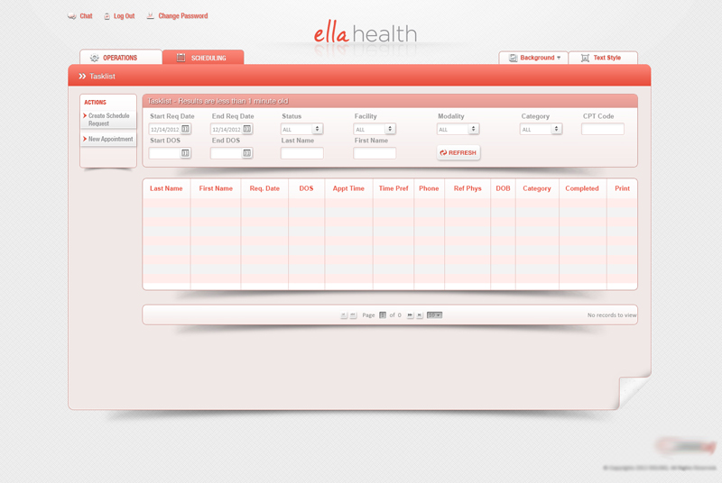
✔ 40% Faster Appointment Scheduling – Reduced unnecessary steps.
✔ Enhanced Accessibility – Optimized for elderly patients & mobile users.
✔ Seamless Patient-Doctor Experience – Created an intuitive dashboard & reminders system.
✔ Increased Patient Engagement – Higher retention due to personalized features.
✔ User research drives better solutions – Early interviews & surveys led to highly targeted improvements.
✔ Accessibility is critical in healthcare UX – Small UI tweaks significantly improved usability for elderly users.
✔ Iterative testing refined the experience – Each usability test resulted in major design enhancements.
Led a cross-platform design system synchronization initiative using the Phoenix Framework to improve scalability, visual consistency, and handoff clarity across design and development teams.
Confidentiality Note:
This project is confidential. Visuals and internal data cannot be publicly shared. Please contact me for more information.
This project focused on auditing and synchronizing core design components across different tools (Sketch, InVision, Figma) and environments to improve consistency, scalability, and design-to-dev collaboration. As UX Lead, I spearheaded a comprehensive system-level alignment initiative to future-proof the Phoenix Design System across teams and platforms.
✘ Design inconsistencies were emerging across platforms and environments due to fragmented tooling and undocumented changes.
✘ Component variants were duplicative, outdated, or out of sync, impacting efficiency and developer handoffs.
✘ The Phoenix Design System lacked governance processes for scale and cross-functional ownership.
✔ Audit and synchronize components across platforms (Figma, InVision, Sketch, and live environments).
✔ Ensure system-wide alignment with business and engineering goals.
✔ Establish scalable, documented components that support rapid design and development workflows.
✔ Reduced redundant components by 35%, improving design efficiency and library usability.
✔ Improved design-to-development parity, reducing UI implementation errors across teams.
✔ Enhanced cross-team collaboration by aligning vocabulary, expectations, and documentation.
✔ Established a scalable, maintainable design system that’s ready for future product expansion.
✔ Even the best design systems degrade without governance and active collaboration.
✔ System-level thinking requires empathy for both designers and developers.
✔ Consistency isn’t just visual—it’s about creating trust and speed across teams.
Led the first accessibility initiative for the Phoenix Design System, reviving outdated components and aligning them with ADA compliance standards. Delivered a scalable accessibility documentation model for product teams and engineers.
Confidentiality Note:
This project is confidential. Visuals and internal data cannot be publicly shared. Please contact me for more information.
Following stakeholder feedback from multiple product teams, I initiated a cross-functional effort to address growing concerns around accessibility. The Phoenix Framework, our internal design system, had fallen out of compliance with ADA/WCAG standards due to prolonged lack of updates.
As the first UX lead to take ownership of accessibility documentation, I spearheaded a strategic accessibility upgrade of Phoenix Design System components to improve usability, meet legal standards, and future-proof the design system.
✘ Phoenix Framework components were outdated and lacked ADA/WCAG 2.1 compliance.
✘ No existing documentation or governance around accessibility best practices.
✘ Designers and developers had an inconsistent understanding of accessibility expectations.
✔ Audit all Phoenix Framework components for accessibility gaps.
✔ Deliver ADA-compliant documentation with examples and usage guidelines.
✔ Equip teams with knowledge and tools to build inclusive, compliant products.
✔ Modernized and documented 100+ Phoenix components to align with WCAG 2.1 AA standards.
✔ Reduced compliance gaps across teams, accelerating design and dev handoff with clarity.
✔ Enhanced usability for all users while meeting legal and ethical accessibility requirements.
✔ Sparked cross-functional support for ongoing accessibility governance.
✔ Reviving a design system requires both technical auditing and cultural advocacy.
✔ Accessibility is a shared responsibility that starts with clear documentation and ownership.
✔ Aligning design and engineering teams through systemic change leads to lasting product impact.
